Lessons learned through visualizing COVID-19
By Kenna Camper
Kenna Camper is a graduating senior at the University of Chicago. For the last year, she has worked as a Research Assistant with the US Covid Atlas Project and Center for Spatial Data Science.
Editor’s note: The US COVID Atlas team is grateful for the work that Kenna has contributed over the past year, including generating stunning graphics (some of which are featured below) and compelling insights for the Atlas coalition and user community. Congratulations to Kenna & all 2021 graduates!
As summer approaches, I’m about to wrap up a year of working with the US COVID Atlas as a research assistant. Prior to when I began working with the Atlas in the fall, I remember being overwhelmed by the constant news updates about COVID. I saw videos and article headlines that talked about rising case rates and hospitalizations in many cities, but I had no idea what COVID trends looked like across the US. When I joined the Atlas team, I thought it would be a great way to learn more about data visualization and would help me better understand the distribution of cases across states. Through my experience with using the Atlas and researching COVID case and vaccination trends, here are some of the lessons I learned.
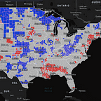
The value of visualization in tracking trends
When I first began writing updates for the Atlas about the geography of COVID, I looked for areas of emerging risk, hotspot clusters, and stable hotspots. Comparing data in the Atlas’s natural break, hotspot, and box maps made finding these areas efficient and easy to talk about. The different color values assigned to the maps, such as the yellow-to-red gradient for the natural breaks map or the blue and red for the hotspot map made interpreting the data feel more intuitive.
Disparities in healthcare
One of the biggest lessons I learned was about healthcare disparities among minority communities. Dr. Lawrence Brown’s research on hypersegregation and COVID taught me about the link between certain urban hotspot areas and their history of racial segregation. In combination with viewing data using the Atlas’s overlays, I saw how minority communities were disproportionately impacted by COVID and had less access to healthcare resources. Dr. Brown explains how, especially in the Deep South, discrimination and mass incarceration caused prisons to become hotspots. Due to the tightly packed spaces, lack of testing and healthcare, and the contagious nature of COVID, the virus quickly spread throughout prisons. Already more likely to have a lack of basic resources and healthcare, Native American reservations have also been hit hard by the virus. Throughout the pandemic, there has been a lack of testing and public health data among reservations. At one point, Navajo Nation had a higher COVID case rate than any state in the US.
Contextualizing data in the real world
Through exploring and writing about the visualizations created by Dylan Halpern, our principal software engineer, I’ve learned about how visualizing data in real world contexts can help people understand the data on a personal level. With the extremely high numbers of COVID cases during the pandemic, it was difficult for me to comprehend the populations that these statistics actually represented. When Dylan showed icons of people in locations that I’ve been to, I was able to understand how huge these amounts of people are.
Similarly, I’ve learned about the importance of viewing large amounts of data and individual stories together. Seeing state and county level COVID cases and vaccination data on the map of the U.S. gave me a sense of what the state of the pandemic was like across the country, and hearing personal stories showed me how those statistics were impacting people’s daily lives. By looking at hotspots on the Atlas with overlays of racial and ethnic groups, reading research about disparities in vaccine distributions, and hearing people talk about their experiences with living in vulnerable communities, I could see the connection between the data and individual people.
This past year, the pandemic changed everyone’s lives — but certain groups were disproportionately impacted more than others. Working on research for the Atlas showed me the importance of data visualization in uncovering and bringing to light these issues that are hidden in data. Reflecting on my work with the Atlas communications team, I’m thankful for how much this experience taught me about interpreting data and trends and for the opportunity to share this information with others through this blog and social media.